CSS
CSS Grid vs Flexbox: When to Use Which
Learn the strengths and use-cases of CSS Grid and Flexbox for responsive layouts.
Assegid Assefa
Nov 15, 2023
4 min read
CSS Grid vs Flexbox: When to Use Which
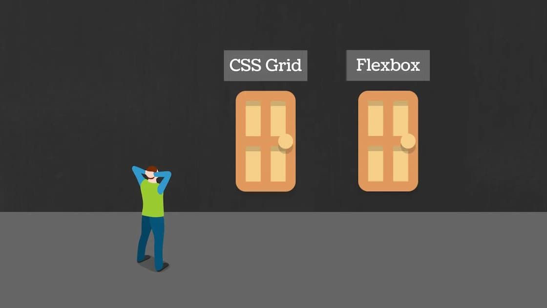
Choosing the right layout system is essential for responsive web design.
Flexbox
- One-dimensional layout: rows or columns
- Ideal for dynamic content and alignment
CSS Grid
- Two-dimensional layout: rows and columns
- Perfect for complex, large-scale layouts
Example
.container {
  display: grid;
  grid-template-columns: repeat(3, 1fr);
}
Conclusion
Use Flexbox for simpler, flow-based layouts. Use Grid when you need more structure and control.
Tags
CSS
Layout
Grid
Flexbox